Tridib Ray (he/him)

I am a Product Designer. I have a background in architecture & 4 years of multi-sector experience in India in retail design, design research and teaching. Having worked in diverse teams, leading design development, and co-managing design incubation, I am currently completing masters in Product Design Engineering at Glasgow School of Art, learning the engineering side of products while enhancing my design skills in a multi-national and multi-disciplinary environment. Striving to apply and enhance end-to-end product design knowledge from visioning, form, user experience, manufacturing to marketing and management, I have arrived at the postulate of Autonomous-ness being the evident future of humanity.

Berserkir
The design of the autonomous delivery robot Berserkir is aimed at improving pedestrian interactions through an approach of understanding artificial intelligence and its perception by humans that determines acceptance of such robots. Robots pervading our landscape is still an uncomfortable and unfamiliar thing in the minds of many. Apart from the visual discomfort, psychological risks, physical hazards, the core idea of Artificial Intelligence (AI) is relatively an alien concept. However, a multi-disciplinary literature study on cognitive science, anthropomorphism and designing AI agents points to some positive outlooks. Besides, technological leaps and the idea of ‘sci-fi’ in popular culture has furthered the idea of AI as ‘friendly and reliable’. There is an array of expectations that users have when it comes to AI interaction, and the aim of this project is not just to empathize with those, but also create an emotional design that facilitates efficient amicable operation, sharing space in a pedestrian friendly zone.
The design starts with the core idea of ‘how to design an AI agent which is NOT threatening and unfamiliar’. Based on the ‘Uncanny Valley’ graph of familiarity vs human likeness, there is a very precarious area of an AI being considered ‘friendly’, something that triggers a positive emotional response and protective instincts in humans- something that’s life-like, an animal, a cute one. This design takes that as a core concept and aims to create something ‘cute’ , ‘approachable’ and ‘familiar’. At the same time, functionality of the robot is maintained through bringing a little ambiguity or neutrality to the ‘cuteness’ so that negative interactions with miscreant humans or pets can be avoided. Thus, the form of a ‘baby rhino or warthog (of Timon and Pumbaa cartoon fame)’ is used to create an image of a functional but friendly robot. The other aspects which are kept in mind are the interactions- like light indicators, stumpy legs, and a grounded form- making it practical yet retaining animal-like familiarity. Lastly, the materials and manufacturing processes are expected to be biodegradable and recyclable to keep carbon footprint low. The usage is also expected to be long term with lesser replacements, and the AI adapting and improving its interactions as it ages, making it sustainable.
Form ‘less threatening’ and animal like familiarity
The form has the majority of the bulk at the back for storage of delivery goods and insulation to take care of the functional components. The design incorporates features of an animal with an interface equipped for needed interactions without being threatening to passing pedestrians. The shape profile is a ‘body’ form that settles rather than launches, sticks to the ground rather than flying. This avoids ‘sudden surprise’ to passers-by as a drone may have.
Friendly but on a mission
The idea has been to make it friendly enough but not too much so that it can focus on its main function of efficient delivery. That’s why the structure imitates a baby rhino or warthog- familiar, friendly but on a mission. The seamless LED screen emotes according to the situation. A portion of the top comes out like a ‘horn’ if strong reactions need to be shown in case of pedestrians mistreating the robot much like an animal reacting to a threat.
‘Eyes’ and ‘Tail’ indicators
The indicators at the front ‘eyes’ and the back ‘tail’ have lights for signaling presence and movement, more recognisable at night. The ‘eye’ changes direction with movement imitating an organism turning and leaving. The ‘tail’ lights up in a red circle when the robot slows down/stops and a blue line when it speeds up/moves.
Stumpy legs
The design of the ‘legs’ has been a key research focus for giving a form and feel to the robot. The stumpy legs (pounded at the ends) have been chosen over thin and pointy due to two reasons- requirement of medium speed of movement and to create the less threatening ‘baby rhino/warthog likeness’. The legs help the robot to raise and lower different parts of the body form. The legs bend inwards to not look scary or dominating.
Products of nature
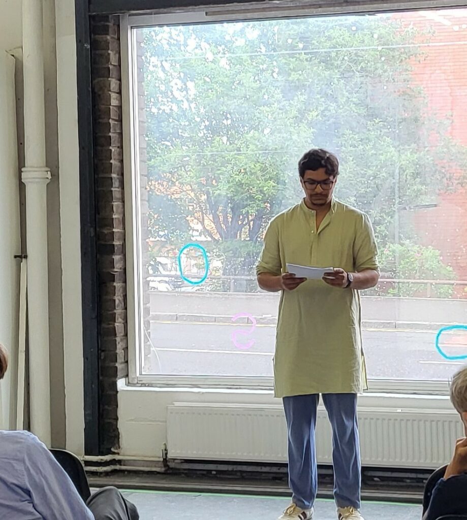
As a part of the Creative Publishing in the Arts class, the essay written followed an autoethnographic writing form linking my personal experiences in India and UK to the progression of the language of product design. This was then turned into an artwork as part of a 3-day exhibition and readings (The Pleasure of the Page) organised by the cohort.
An excerpt from the essay is below.
‘As I walk towards the Central station, I am promptly forced to think of elements in my surroundings that resemble objects back home. It is difficult to see a sense behind this train of thought, but it’s the unsought sense of security that my mind seeks. There are obvious logical similarities, the insides look the same, the chairs, the elevators; I ignore the absence of fans, and the air-conditioning of the tropical
nations are many a time central and hence concealed, the street dimensions match that of Lodi Colony (in New Delhi) back home, cars look similar, although there’s much higher glass in the buildings, but once the sun comes out, the streetscapes form the same shadows. And then there are metaphysical connections as well, times when I look out the window and the burned facade of the school (GSA)
reminds me of the Chawls in Bombay, an unexpected conversation with a lovable elderly couple takes me back to visits to my relative, the window of the train I’m sitting in, passing through snow-clad towns, with the kid in the nest seat watching a commentary on ‘Powerpuff girls’ gives me the same emotions as that of the travel to my maternal home. These two worlds are poles apart, but there are still similarities among a sea of these dissimilarities. A multitude of reasons might make up for these visual, physical or psychological branding phenomena.’


