Fern Megan Murphy (She/Her)

My name is Fern Murphy and I am a Textile print/Fashion designer from Glasgow, as a surface led fashion designer it is my ambition to utilise my unique trained skills and combine them with an expressive 3D context in mind. Taking consideration into placement and scale is the drive within my projects. Creating prints using hand dyed methods and screen printing as I enjoy very tactile creative processes that lead to the final outcome being unique to me as a designer. Being a specialist in colour design allows for the creation of comprehensive colour pallets that shape a strong mood and atmosphere amongst my collections. I feel passionate about societies breakthrough within gender association and reflect this within my work, creating gender neutral collections that also considers a responsible design outlook.


Profile Image
DEFECT FORM | Appreciating the Imperfect
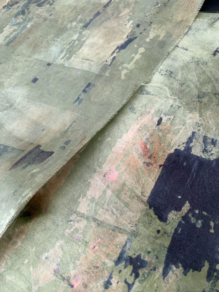
My final self-directed project began by communicating an appreciation and a curiosity for the imperfect surfaces around us. The substandard yet aesthetic perspective seen from architectural surfaces after the impact from the environment and society constructed an effective visual language. Giving character that at times goes unnoticed. Depicting colour and understanding the theoretic of tonal combinations and showing how they can complement each other on the body. Furthermore, using hand dying techniques that research deeper into the multitude of colours that can be discovered through defined formulas and time spent in the dye lab. Consequently, I have been able to recreate textural prints that reference my initial visual interests. Along with having great inspirational influence from Japanese designer Rae Kawakubo, creating large scale geometric silhouettes that have volume and form.
Colour Documentation
Colour Research has a been a fundimental element to this collection as the in-depth analysation of tonal combinations led to unique colour choices seen throughout each garment. Throughout the development of this collection there was a lot of time spent in the dye lab curation a colour log of specific dying techniques and formulas. Understanding how successful each colour was along side another and having a wide range of tones to work with gave the work a strong sense of mood.
WIP | SURFACE
My final self-directed project began by communicating an appreciation and a curiosity for the imperfect surfaces around us. The substandard yet aesthetic perspective seen from architectural surfaces after the impact from the environment and society constructed an effective visual language. Giving character that at times goes unnoticed. Depicting colour and understanding the theoretic of tonal combinations and showing how they can complement each other on the body. Furthermore, using hand dying techniques that research deeper into the multitude of colours that can be discovered through defined formulas and time spent in the dye lab. Consequently, I have been able to recreate textural prints that reference my initial visual interests. Along with having great inspirational influence from Japanese designer Rae Kawakubo, creating large scale geometric silhouettes that have volume and form.

PHOTO CATALOGUE
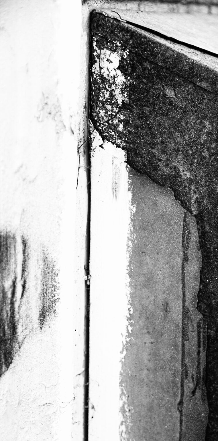
Collecting a strong visual language with initial photography images were key in the process of imitation through fabric choice and print. Using a Macro Lens to capture close up textures that at times go unnoticed. Photography for me is a way to create a strong mood and atmosphere to a project/Collection. I used these to shape both silhouette and surface ideas that when combined showed a clear representation of my creative thoughts.
WIP | SILHOUETTE
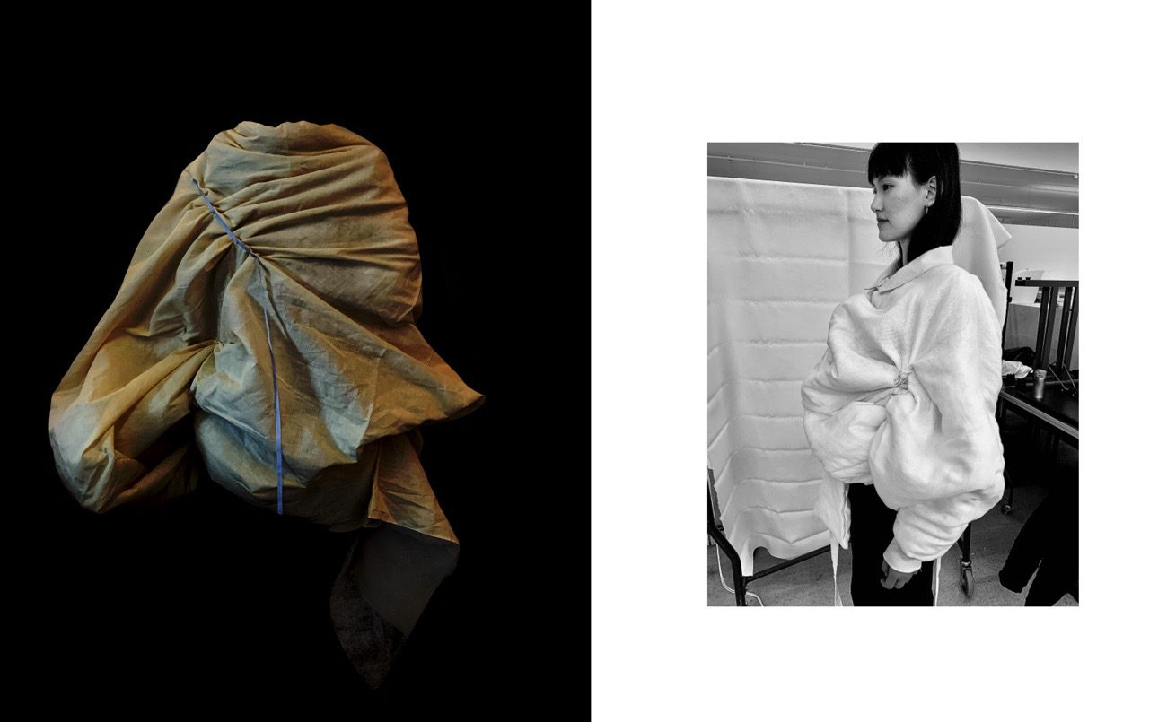
The silhouette for my collection was heavily inspired by Japanese designer Rae Kawakubo, her unique expressive form and angular edges helped the development of each garment.


